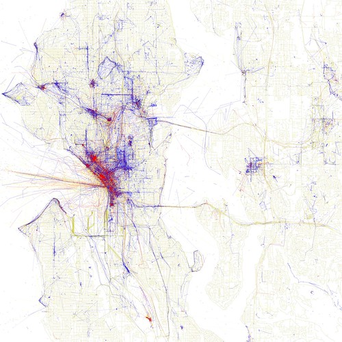
Following up on the Geotaggers' World Atlas, Eric Fisher has dug deeper into the data to try to distinguish photos taken by tourists from those taken by locals. It illustrates the point about the difference between a relatively superficial tourists'-eye-view of a city and the real workings of it from the point of view of locals even better than the previous maps did, as you can see in the Seattle one:
Tourists (those whose photos are all from within a month of each other) show up in red, locals in blue, and those who the algorithm couldn't place in yellow. The locals' photos still show a distinct concentration on the prettier parts of town, but they're dramatically wider ranging than the tourists'.
I am particularly conscious of this right now, because I am in London, a city where I'm halfway between a tourist and a local because I grew up here and come back to visit family and friends, but haven't lived here since I moved away for university. I've been collecting observations of the city from that perspective, and I'll write a few up over the next couple of weeks.


No comments:
Post a Comment